


Choosing the right colour for your home interior can be a very daunting task. Picking the right colour is like giving life to your spaces. It is the most critical decision one has to make in any interior design project. The colours you choose can affect everything, from materials to furniture. Moreover, colour can convey a lot of emotion. Therefore creating an atmosphere you desire for your space.
One can walk right into a room and feel different emotions on seeing the colours of your space. For example, let’s try to think of a few scenarios. The walls are white, the ceiling is white and the floor as well is white, and the furniture and decorative pieces as well are white. How will it convey to you? Now let’s imagine a space where the walls and ceilings are white, and have got a wooden floor. The furniture in the space is in neutral tones, such as beige or brown, and here and here, there are touches of colours. How will this space make you feel? It will be entirely different from the first scenario. This space will give you different emotions and sensations than the first. This is the importance of colours in interior design and why it’s important to choose the right colour.
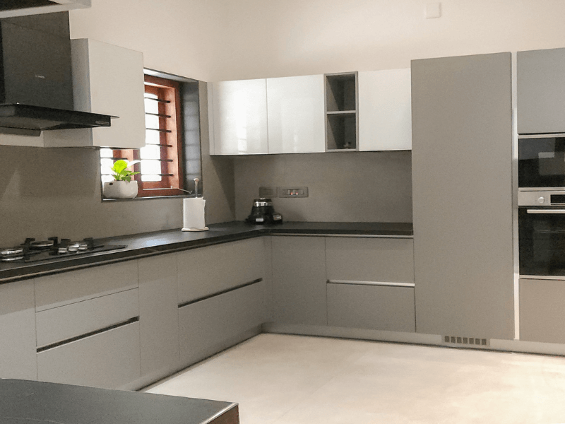
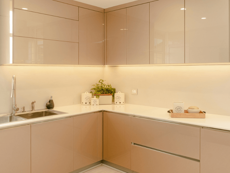
Colours are something that defines the personality and character of any space. One of the prime interior designers in Kochi, Uniwood suggests colour combinations like Sage green and walnut, Beige and Royal blue and Tan and Emerald green for a perfect outcome. These colours can transform any space into a striking atmosphere, and bring emotions which can be beyond words. So, when choosing a colour combination is a careful procedure that can go beyond just personal taste.
This blog, “How to Choose the Best Interior Design Colour Combination for Your Home” will give you an idea of how to choose the perfect colour combinations for your home interior and why it’s important to choose carefully! Now let’s get into understanding the array of colours in detail and explore how you can choose them according to your taste.
Colours in interior design
In interior design, colours go beyond just looks. The right use of colour can turn a boring uninspiring space into a colourful and inviting one. Colours can evoke emotions, create a mood and add to the visual drama of a room. For example, light colours can make a small space look bigger and more open and dark colours can add warmth and intimacy.
In addition to the atmosphere, colours reflect the occupant or the purpose of the space. The right colour scheme can create a style and give a personality to a room making it more than just a functional area but an expression of you.
Colours are versatile and can fit into any design trend. A simple colour change can freshen up a room without structural changes. And let’s not forget the functional side of colours, light colours reflect light and dark colours create calmness.
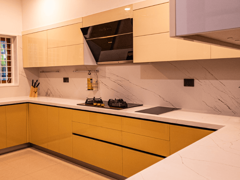
For example choosing colour combinations like Sage green and walnut, Beige and Royal blue and Tan and Emerald green can enlighten your space, giving the aesthetic look you want. The colour combination, Sage Green and Walnut gives a calming, earthy atmosphere. The colour sage green brings a sense of tranquility and a connection to nature, Whereas, walnut gives a tone of warmth and sophistication because of its deep and rich tones. Together, these two colours will make your space, both grounded and luxurious.
Beige and Royal blue, is a perfect combo that keeps the balance between classic and contemporary. Beige, a neutral and versatile colour, offers a warm and welcoming tone. And when it is paired with royal blue, a bold and regal shade, it brings a sense of depth and luxury to your room.
Tan and emerald green are a blend of warmth and coziness. Emerald green gives a vibrant, lush feel. It’s a perfect combination for living spaces, kitchens, or outdoor areas, bringing out a chic, modern edge.
In short, colours in interior design is not just about decoration; it’s a tool to shape the mood, perception and functionality of any space and overall balance.
How to use the colour wheel
The colour wheel is a basic tool in interior design to understand how colours work and relate to each other. It helps designers to create balanced and visually pleasing combinations by showing tones, hues and saturation in a clear visual way.
The colour wheel has primary colours (red, blue and yellow), secondary colours (green, orange and purple) and tertiary colours which are created by mixing primary and secondary colours. This circular arrangement helps to identify colour relationships and choose harmonious combinations for a space or design.
Here are the colour schemes:
Complementary colours: Colours opposite each other on the wheel like blue and orange create strong contrasts and make a room feel lively and dynamic.
Analogous colours: Colours next to each other on the wheel like blue and green create a soft and harmonious effect.
Triadic colours: Three colours equally spaced around the wheel like red, yellow and blue create a balanced and lively scheme.
By mastering the colour wheel, designers can ensure their colour choices are both aesthetically pleasing and strategically effective.
7 steps to choose the right colours
Understand the Space
Before you choose a colour palette, you need to define the purpose of the space. For living rooms where socialising and cosiness is key, warm and inviting colours like blue and yellow are perfect. Bedrooms need calming neutral colours, and home offices benefit from stimulating colours like orange, yellow or brown to boost productivity and focus.
Consider Ambient Light
Lighting plays a big part in how colours are seen. Natural and artificial light can change the way colours look throughout the day. Testing colour samples in different lighting conditions will ensure they look the same in sunlight or artificial light.
Look into the Psychology of Colours
Colours affect emotions and moods. When choosing a palette, consider how you want the space to feel. Cool tones create a relaxing, calm atmosphere, and warm tones energise and uplift a room. Align the colour with the mood you want to achieve.
Define the Decor Style
The decor style of the room will guide your colour choices. For example, minimalist spaces tend to use neutral tones like white, beige and grey, while modern spaces can use bold colours. Rustic spaces use earthy tones to add a natural, grounded feel to the room.
Consider the Space Dimensions
Colour affects how we see a room’s size. Light colours make small spaces feel more open, dark colours add warmth to larger spaces. Getting the balance right is key to the spatial experience.
Make it Work with Furniture
Don’t just consider the walls and floors but how colours work with furniture and decor. Choose a palette that matches or contrasts with these elements to create visual harmony.
Keep up to Date
Trends can be a great inspiration but the client’s personal taste comes first. Keeping up to date with design trends like Pantone’s Colour of the Year can give you ideas but the palette should be about the client’s vision and needs.
What we have discussed above are some tips you can consider while selecting the colour combinations for your dream home. Always remember, Colour is not just colour; it’s energy. It can completely change your mood. If you need further assistance, connect with the best interior design companies in Kerala, Uniwood to help you choose the right colours for your space.